CSS3 转换过渡动画
前言
在过去,我们想要页面上实现动画效果,往往是需要通过 javascript 脚本来进行事件监听执行的,如今 css3 的推出,我们可以更简洁地实现动画效果,本文将主要从 transform、transition、animate 三大点出发,对其的属性进行深度的梳理。
transform

转换属性允许你旋转,缩放,倾斜或平移给定元素。这是通过修改 CSS 视觉格式化模型的坐标空间来实现的。其中转换属性可以根据转换后的效果分为 2D 和 3D 的,下面将分别从属性值和使用方式进行介绍。
2D transform
相关属性值:
- translate(x, y) -
平移,根据 x,y 轴对应的值进行相对位置移动,类似 position:relative;translate(x) 等同于 translate(x,0);可选单位:css 中关于长度单位均可。- translateX(x) - 仅设置 x 轴上的偏移位置。
- translateY(y) - 仅设置 y 轴上的偏移位置。
- rotate(deg) -
旋转角度,根据 deg 角度的设定让元素以自身中心位置为原点发生旋转;可选单位:deg(css 中表示角度的单位)。 - scale(mul) -
缩放,根据 mul 缩放倍数根据自身中心位置为原点发生放大缩小效果,mul 参数是一个大于等于 0 的实数,默认值:1,大于 1 表示放大,小于 1 表示缩小。- scaleX(mul) - 改变元素的宽度。
- scaleY(mul) - 改变元素的高度。
- skew(<angle> [,<angle>]) -
倾斜角度,分别表示 X 轴和 Y 轴倾斜的角度,如果第二个参数为空,则默认为 0,参数为负表示向相反方向倾斜;可选单位:deg(css 中表示角度的单位)。- skewX(<angle>) - 表示只在 X 轴(水平方向)倾斜。
- skewY(<angle>) - 表示只在 Y 轴(水平方向)倾斜。
- matrix(a, b, c, d, tx, ty) - 是 2D 变换方法的
组合设置,设置缩放,倾斜和移动(平移)功能。。- a - 水平缩放
- b - 水平倾斜
- c - 垂直倾斜
- d - 垂直缩放
- tx - 水平移动
- ty - 垂直移动
<!-- 2d 案例 -->
<style>
  * {
    margin: 0;
    padding: 0;
  }
  .child {
    width: 100px;
    height: 100px;
    background-color: #8e44ad;
    transform: translate(150px, 60px) rotate(-35deg) scale(1.5) skew(1deg);
    /* transform: matrix(1.5, 0, 0, 1.5, 150, 60); */ /* 除了旋转外的同等配置 */
    color: #fff;
  }
</style>
<body>
  <div class="child">2D 转换</div>
</body>
3D transform
相关属性值:
- translate3d(x,y,z) - 定义 3D
转化。- translateX(x) - 仅使用用于 X 轴的值。
- translateY(y) - 仅使用用于 Y 轴的值。
- translateZ(z) - 仅使用用于 Z 轴的值。
- rotate3d(x,y,z,angle) - 定义 3D
旋转。- rotateX(angle) - 定义沿 X 轴的 3D 旋转。
- rotateY(angle) - 定义沿 Y 轴的 3D 旋转。
- rotateZ(angle) - 定义沿 Z 轴的 3D 旋转。
- scale3d(x,y,z) - 定义 3D
缩放转换。- scaleX(x) - 通过给定一个 X 轴的值。
- scaleY(y) - 通过给定一个 Y 轴的值。
- scaleZ(z) - 通过给定一个 Z 轴的值。
- matrix3d(a1, b1, c1, d1, a2, b2, c2, d2, a3, b3, c3, d3, a4, b4, c4, d4) - 定义 3D 转换,使用 16 个值的 4x4 矩阵。
- perspective(n) - 定义 3D 转换元素的
透视视图。- perspective() 这个 CSS 函数定义了 z=0 平面与用户之间的距离,以便给三维定位元素一定透视度。当每个 3D 元素的 z>0 时会显得比较大,而在 z<0 时会显得比较小。其影响的程度由这个属性的值来决定。
- 该参数是一个 <length> 给定从用户(显示屏)到 z = 0 平面的距离。 它用于将透视图转换应用于元素。 如果它是 0 或负值,则不应用透视变换。
相关单位与 2d 的一致,就不过多描述,直接上案例。
<style>
  * {
    margin: 0;
    padding: 0;
  }
  body {
    padding: 100px;
  }
  .child {
    margin-bottom: 20px;
    width: 100px;
    height: 100px;
    color: #fff;
  }
  .translate3d {
    background-color: #8e44adee;
    transform: translate3d(30px, 30px, 30px);
  }
  .rotate3d {
    background-color: #2980b9ee;
    transform: rotate3d(20, 20, 20, 10deg);
  }
  .scale3d {
    background-color: #2c3e50ee;
    transform: scale3d(1.2, 1.2, 1.2);
  }
</style>
<body>
  <div class="child translate3d">3D 转化</div>
  <div class="child rotate3d">3D 旋转</div>
  <div class="child scale3d">3D 缩放</div>
</body>
其它相关转换属性
transform-origin
transform-origin 属性允许您更改转换元素的位置。默认转换位置是在元素的正中心。 2D 转换元素可以改变元素的 X 和 Y 轴。 3D 转换元素,还可以更改元素的 Z 轴。
/* 语法 */
transform-origin: x-axis y-axis z-axis;
可选值:
- x-axis - 定义视图被置于 X 轴的何处。可能的值:left、center、right、length、%。
- y-axis - 定义视图被置于 X 轴的何处。可能的值:left、center、right、length、%。
- z-axis - 定义视图被置于 Z 轴的何处。可能的值:length。
transform-style
transform--style 属性指定嵌套元素是怎样在三维空间中呈现。 注意: 使用此属性必须先使用 transform 属性.
可选值:
- flat - 表示所有子元素在 2D 平面呈现。
- preserve-3d - 表示所有子元素在 3D 空间中呈现。
perspective
多少像素的 3D 元素是从视图的 perspective 属性定义。这个属性允许你改变 3D 元素是怎样查看透视图。 定义时的 perspective 属性,它是一个元素的子元素,透视图,而不是元素本身。perspective 属性只影响 3D 转换元素。
可选值:
- number - 元素距离视图的距离,以像素计。
- none - 默认值。与 0 相同。不设置透视。
perspective-origin
perspective-origin 属性定义 3D 元素所基于的 X 轴和 Y 轴。该属性允许您改变 3D 元素的底部位置。 定义时的 perspective -Origin 属性,它是一个元素的子元素,透视图,而不是元素本身。
/* 语法 */
perspective-origin: x-axis y-axis;
可选值:
- x-axis - 定义该视图在 x 轴上的位置。默认值:50%。可能的值:left、center、right、length、%。
- y-axis - 定义该视图在 y 轴上的位置。默认值:50%。可能的值:left、center、right、length、%。
backface-visibility
backface-visibility 属性定义当元素背面向屏幕时是否可见。
可选值:
- visible - 背面是可见的。
- hidden - 背面是不可见的。
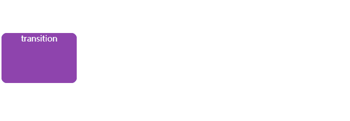
transition
过渡可以为一个元素在不同状态之间切换的时候定义不同的过渡效果。比如在不同的伪元素之间切换,像是 :hover,:active 或者通过 JavaScript 实现的状态变化。
<!DOCTYPE html>
<html>
  <head>
    <meta charset="utf-8" />
    <title></title>
    <style>
      .child {
        margin-top: 100px;
        display: flex;
        place-content: center;
        width: 150px;
        height: 100px;
        background-color: #8e44ad;
        border-radius: 10px;
        color: #ffffff;
        transition: transform ease-in-out 1s, background-color 0.5s ease-in-out 0.5s; /* 定义过渡 */
      }
      .child:hover {
        transform: translateX(20vw) scale(1.2) rotate(360deg);
        background-color: #2980b9;
      }
    </style>
  </head>
  <body>
    <div class="child">transition</div>
  </body>
</html>
相关属性
transition-property
transition-property:指定应用过渡属性的名称。默认值:all。
可选值:
- none - 没有过渡动画。
- all - 所有可被动画的属性都表现出过渡动画。
- IDENT - 属性名称。由小写字母 a 到 z,数字 0 到 9,下划线(_)和破折号(-)。第一个非破折号字符不能是数字。同时,不能以两个破折号开头。
transition-duration
transition-duration:属性以秒或毫秒为单位指定过渡动画所需的时间。默认值为 0s ,表示不出现过渡动画。
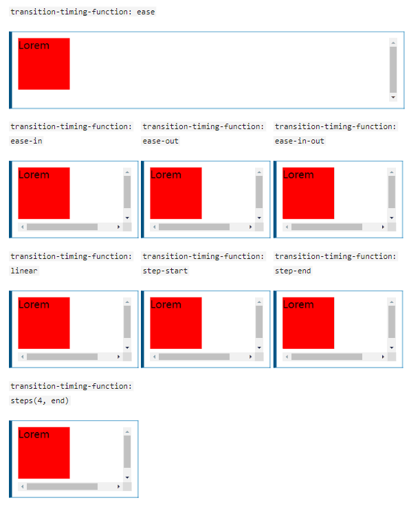
transition-timing-function
transition-timing-function:指定切换效果的速度。
可选值:
- linear - 规定以
相同速度开始至结束的过渡效果(同等于 cubic-bezier(0,0,1,1))。 - ease - 规定以
慢速开始,然后变快,最后再以慢速结束的过渡效果(同等于 cubic-bezier(0.25,0,1.0.25,1))。 - ease-in - 规定以
慢速开始的过渡效果(等于 cubic-bezier(0.42,0,1,1))。 - ease-in-out - 规定
以慢速结束的过渡效果(等于 cubic-bezier(0,0,0.58,1))。 - cubic-bezier(n,n,n,n) - 在 cubic-bezier 函数中定义自己的值。可能的值是 0 至 1 之间的数值。
- step-start - 规定在
起点发生跳跃变化。(等同于 step(1, start))。 - step-end - 规定在
终点发生跳跃变化。(等同于 step(1, end))。 - steps(n, state) - 在 steps 函数中分别定义间隔数量和发生阶段跳跃变化的状态。
- n - 常数。指定时间函数中的间隔数量。
- state - 可选参数,属性值:start 或 end。分别是指在开始阶段、结束阶段发生跳跃变化。
transition-delay
transition-delay:属性规定了在过渡效果开始作用之前需要等待的时间。
transition
transition:属性是 transition-property,transition-duration,transition-timing-function 和 transition-delay 的一个简写属性。
在 transition 中传入两个时间参数时候,会默认解析第一个时间参数为 transition-duration,第二个时间参数为 transition-delay。
/* 相关语法:(出自MDN Web Docs) */

/* Apply to 1 property */
/* property name | duration */
transition: margin-right 4s;

/* property name | duration | delay */
transition: margin-right 4s 1s;

/* property name | duration | timing function */
transition: margin-right 4s ease-in-out;

/* property name | duration | timing function | delay */
transition: margin-right 4s ease-in-out 1s;

/* Apply to 2 properties */
transition: margin-right 4s, color 1s;

/* Apply to all changed properties */
transition: all 0.5s ease-out;

/* Global values */
transition: inherit;
transition: initial;
transition: unset;
animation
animations 使得可以将从一个 CSS 样式配置转换到另一个 CSS 样式配置。动画包括两个部分:描述动画的样式规则和用于指定动画开始、结束以及中间点样式的关键帧。
相关属性
- animation-delay - 设置延时,即从元素加载完成之后到动画序列开始执行的这段时间。
- animation-direction - 设置动画在每次运行完后是反向运行还是重新回到开始位置重复运行。
- animation-duration - 设置动画一个周期的时长。
- animation-iteration-count - 设置动画重复次数, 可以指定 infinite 无限次重复动画。
- animation-name - 指定由@keyframes 描述的关键帧名称。
- animation-play-state - 允许暂停和恢复动画。
- animation-timing-function - 设置动画速度, 即通过建立加速度曲线,设置动画在关键帧之间是如何变化。
- animation-fill-mode - 指定动画执行前后如何为目标元素应用样式。
animation-delay、animation-duration、animation-timing-function,与 transition 相关属性类似,可以参考上述内容。
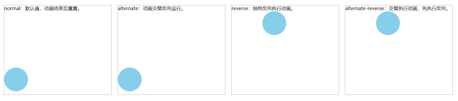
animation-direction
可选值:
- normal - 每个循环内动画向前循环,换言之,每个动画循环结束,动画
重置到起点重新开始,默认值。 - alternate - 动画
交替反向运行,反向运行时,动画按步后退,同时,带时间功能的函数也反向,比如,ease-in 在反向时成为 ease-out。计数取决于开始时是奇数迭代还是偶数迭代。 - reverse - 反向运行动画,每周期结束动画
由尾到头运行。 - alternate-reverse -
反向交替,反向开始交替,动画第一次运行时是反向的,然后下一次是正向,后面依次循环。决定奇数次或偶数次的计数从 1 开始。
<!-- animate-direction -->
<style>
  .main {
    display: flex;
  }
  .container {
    margin: 10px;
    width: 360px;
    height: 300px;
    overflow: hidden;
    line-height: 20px;
    border: 1px dotted #666;
  }
  .item {
    width: 80px;
    height: 80px;
    background-color: skyblue;
    border-radius: 100%;
    animation-name: dire;
    animation-duration: 4s;
    animation-iteration-count: infinite;
    animation-delay: 2s;
  }
  .item1 {
    animation-direction: normal;
  }
  .item2 {
    animation-direction: alternate;
  }
  .item3 {
    animation-direction: reverse;
  }
  .item4 {
    animation-direction: alternate-reverse;
  }
  @keyframes dire {
    0%,
    100% {
      transform: translate(0, 0);
    }
    25% {
      transform: translate(0, 200px);
    }
    50% {
      transform: translate(200px, 200px);
    }
    75% {
      transform: translate(200px, 0);
    }
  }
</style>
<body>
  <div class="main">
    <div class="container">
      normal:默认值,动画结束后重置。
      <div class="item item1"></div>
    </div>
    <div class="container">
      alternate:动画交替反向运行。
      <div class="item item2"></div>
    </div>
    <div class="container">
      reverse:始终反向执行动画。
      <div class="item item3"></div>
    </div>
    <div class="container">
      alternate-reverse:交替执行动画,先执行反向。
      <div class="item item4"></div>
    </div>
  </div>
</body>
animation-count
可选值:
- 正整数。
- infinite - 指定无限次执行动画。
animation-play-state
可选值:
- running - 当前动画正在运行。
- paused - 当前动画已被停止。
animation-fill-mode
可选值:
- none - 当动画未执行时,动画将不会将任何样式应用于目标,而是已经赋予给该元素的 CSS 规则来显示该元素。默认值。
- forwards - 目标将保留由执行期间遇到的
最后一个关键帧计算值。 - backwards - 动画将在应用于目标时立即应用第一个关键帧中定义的值,并在 animation-delay 期间保留此值。
- both - 动画将遵循 forwards 和 backwards 的规则,从而在两个方向上扩展动画属性。
animation
animation 属性是 animation-name,animation-duration, animation-timing-function,animation-delay,animation-iteration-count,animation-direction,animation-fill-mode 和 animation-play-state 属性的一个简写属性形式。
keyframes
keyframes:定义动画中的关键帧,可以定义从 0% 到 100% 之间的动画状态。
语法:
@keyframes anim {
  0% {
    transform: translateX(0px);
  }
  100% {
    transform: translateX(100px);
  }
}
/* 等同于 */
@keyframes anim {
  from {
    transform: translateX(0px);
  }
  to {
    transform: translateX(100px);
  }
}
通过 animate 实现一个简单的 loading 效果,附上代码:

<!-- loading-demo -->
<style>
  * {
    margin: 0;
    padding: 0;
  }
  body {
    display: flex;
    justify-content: center;
    align-items: center;
    width: 100vw;
    height: 100vh;
    background-color: #2c3e50;
  }
  .main {
    display: flex;
    align-items: center;
    overflow: hidden;
  }
  .item {
    margin: 0 10px;
    width: 20px;
    height: 100px;
    background-color: #2980b9;
    border-radius: 15px;
  }
  .item:nth-child(1) {
    animation: loading 1s linear 0s alternate infinite;
  }
  .item:nth-child(2) {
    animation: loading 1s linear 0.25s alternate infinite;
  }
  .item:nth-child(3) {
    animation: loading 1s linear 0.5s alternate infinite;
  }
  .item:nth-child(4) {
    animation: loading 1s linear 0.75s alternate infinite;
  }
  .item:nth-child(5) {
    animation: loading 1s linear 1s alternate infinite;
  }
  @keyframes loading {
    0% {
      height: 100px;
      background-color: #f39c12;
    }
    25% {
      height: 75px;
      background-color: #c0392b;
    }
    50% {
      height: 50px;
      background-color: #27ae60;
    }
    75% {
      height: 25px;
      background-color: #2980b9;
    }
    100% {
      height: 15px;
      background-color: #8e44ad;
    }
  }
</style>
<body>
  <div class="main">
    <div class="item"></div>
    <div class="item"></div>
    <div class="item"></div>
    <div class="item"></div>
    <div class="item"></div>
  </div>
</body>
最后,如果您有更好的方法,欢迎在留言区中分享;或者实际操作中遇到什么问题均可留言或者私信我,感谢您的观看!
官方文档: MDN Web Docs